
Running Pace vs. Heartrate Graph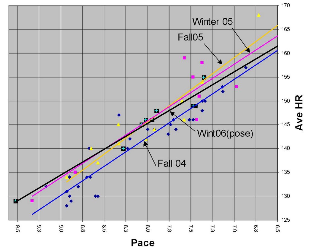
On the graph above, the square, black points are Pose data from my standard, 4-mile run course. All of the other data is the same course using my former heel-strike gait for different periods over the last couple of years. Fall of 2004 is the most efficient so far (I was training a little more then), but the Pose best-fit line is closing in fast.
I've noticed that the pose data reflects lower efficiency the longer I run (not shown on this graph). I think that will become less pronounced as my calf muscles get stronger and my body (and mind) adapt to the new stride.
February 8, 2014
12 years ago


0 Comments:
Post a Comment